The problem
Dashboards tell you what happened. They rarely tell you why bookings dipped, whether your rebooking rate is actually good, or what this month really looks like against last.
The old way, and what it costs
Squinting at charts, exporting to a spreadsheet to compare periods, and guessing whether your numbers are normal for a clinic your size.
Decisions made late or on gut feel, and soft weeks discovered after they have already cost you.
Hours re-cutting the same numbers, and the nagging doubt of not knowing where you stand.
The Sulaia way
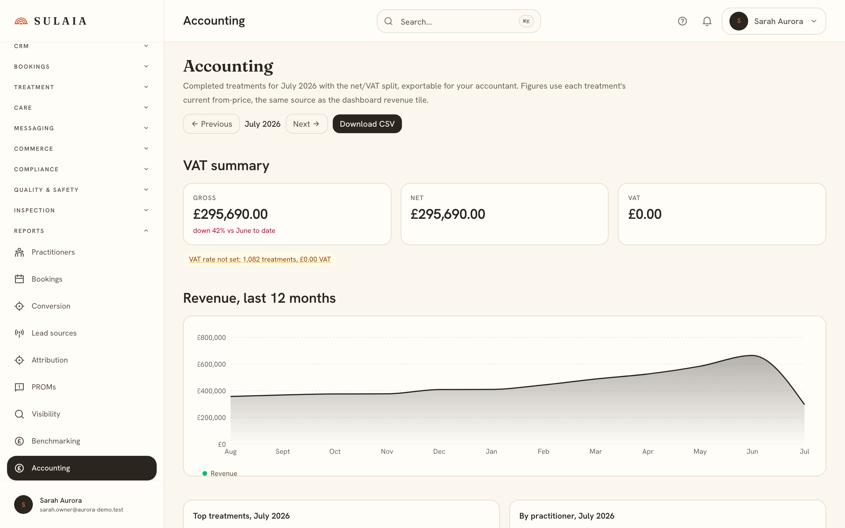
Every headline number links to the list behind it and carries a plain-English line naming what moved it against your 4-week norm. Anonymised peer percentiles sit inside the weekly brief, the accounting view reads the month in ten seconds with a VAT-split export for your accountant, and a proactive card flags the thing most worth acting on today.
What you get
- Why-lines on every headline figure
- Peer percentiles where you already look
- A finance cockpit your accountant will thank you for
- The most valuable next action, surfaced for you